Get In Touch

Dialpad - Creating Quality Call Control with QA scorecards for Contact Center / Sales Managers
We streamline the process to help call center managers to evaluate agent's performance to ensure optimal call quality control.
Role
Product designer working along with a lead designer, Ted Goas
Responsibility
Product design, IXD, user research, product strategy, and overseeing development
Timeline
Aug 2020 - Nov 2020
Released '21
About
Dialpad
Insurance coverage can vary significantly based on various criteria such as employment types, zip codes, or job titles. For example, groups might have life insurance plan that is only offered to executives.
In cases where this variability occurs, the Admins would need to contact the Brokers, where the Brokers will allow an exception in the backend. Then the Admins can then manually identify and select the appropriate insurance type for each employee in the Hiring app. This process is not only tedious, confusing and time-consuming but also prone to errors.

Problem & Pain points
It is hard to assess and conduct call quality control across all the calls for the managers.
To ensure the optimal customer satisfaction, businesses invest hefty on building a team of high-quality customer support agents. However the quality of the agents might not be optimal


Goals
Assess and grade customer conversations for call center managers to provide prompt coaching opportunities to agents
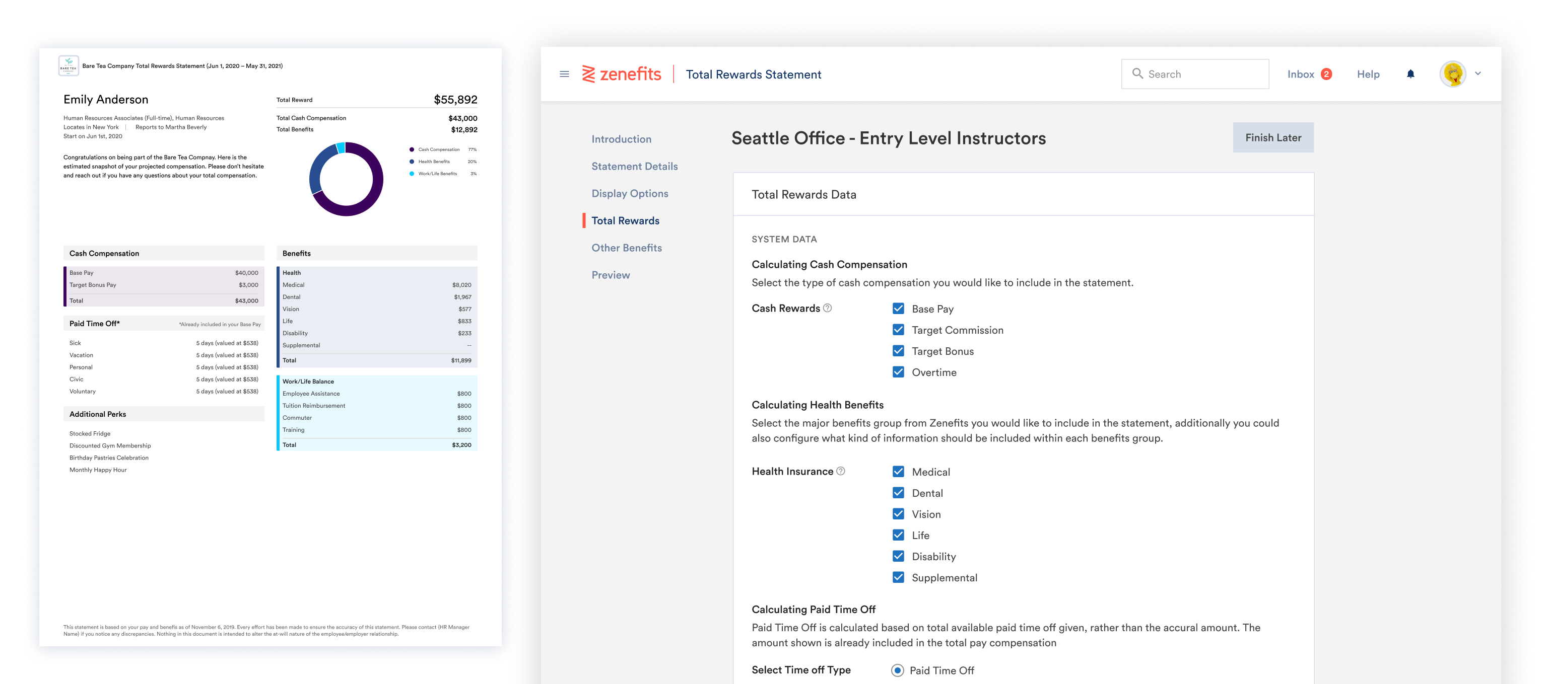
Our team's primary goal was to be able to centralize the actions of customizing benefits package in the Benefits app for the Admins and Brokers. As well as to decrease the workload for both the user types.
Project Goals
- • Customize benefits based on different criteria
• Be mindful and compliant healthcare regulations
Business Goals
- • Upsell customers to purchase Contact Center license
• Decrease in churning = increased retention
• Increase in customer satisfaction
• Fewer support questions
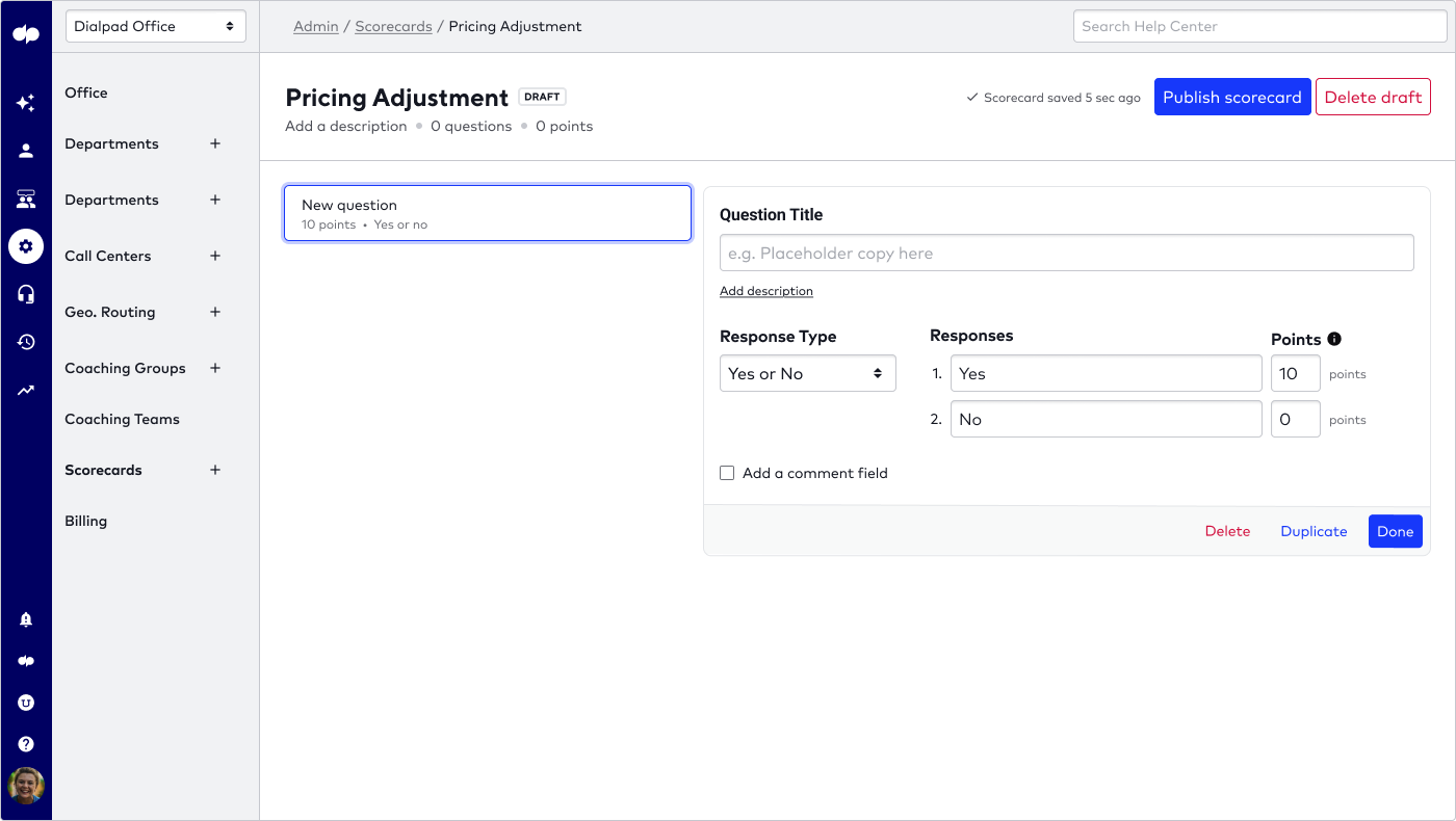
Solutions
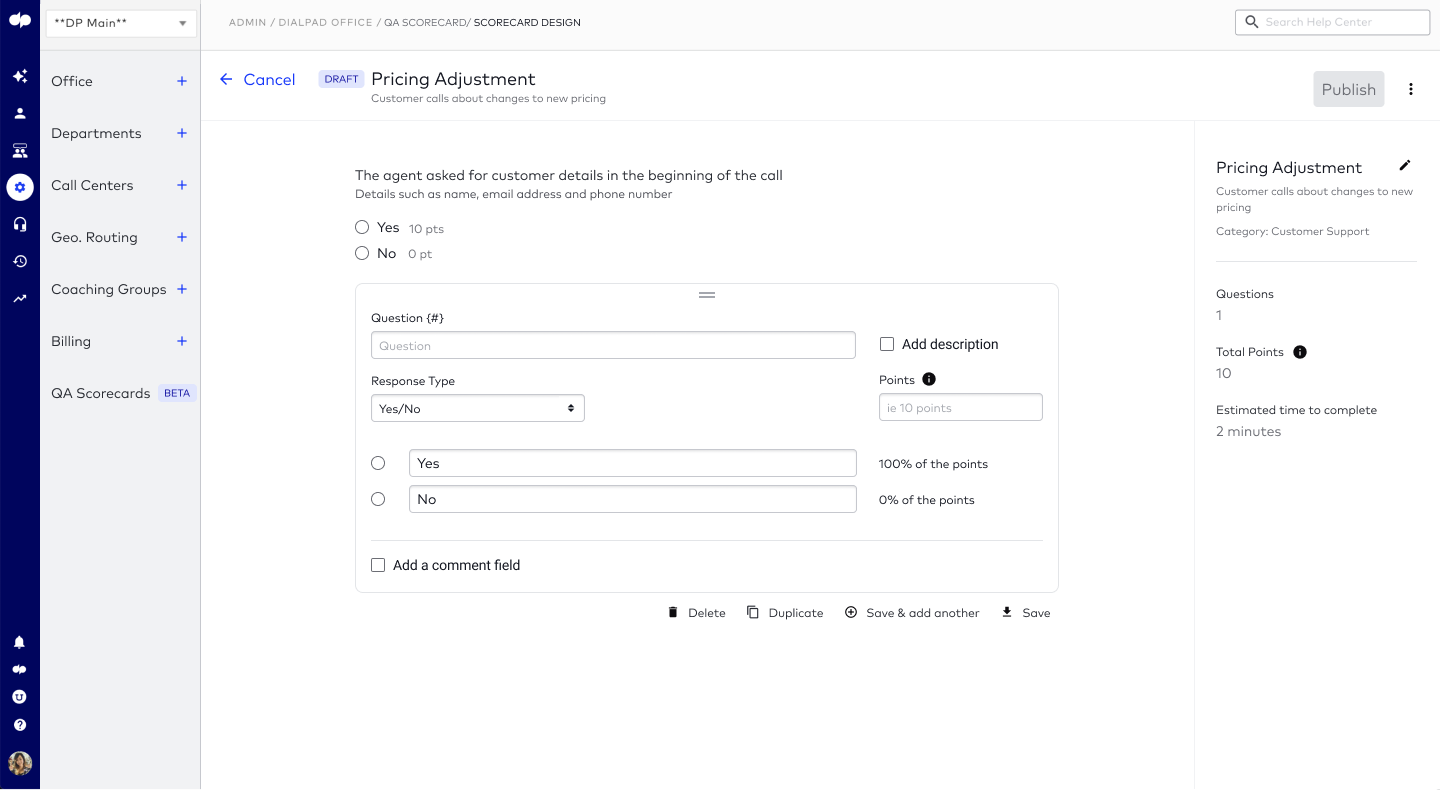
Providing relevant guidance driven by semantic analysis when creating scorecards and grading call summaries
Provide recommended templated questions in the scorecards
Create new scorecards with prebuilt templated questions, or create new templates to build new evaluation criteria
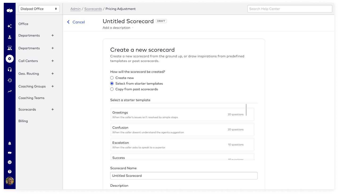
Customizable grading criteria in questions
Brokers and Admin want as much flexibility as possible, we allow them to be able to customize the plans to the classes as much as possible.

Grade calls and view graded calls in a glance
Use existing voice intelligence to conduct semantic analysis and provide suggestions to a question in the scorecard.

Grade calls with transcript or recordings for reference
Use existing voice intelligence to conduct semantic analysis and provide suggestions to a question in the scorecard.

Result
Most sought after feature in Contact Center License
Unfortunately the a new PM joined the project when it was closed to project launch, so desired metrics were not collected properly. However, through chatting with internal sales and CSAT, Ai Scorecard is one of the most sought after feature in the Contact Center license.
View QA scorecards in Demo (2023)
The project was first released in 2021. The company has been through a rebrand since then with an emphasis on labelling Ai. The visual may look different however the general design has stayed the same.
Research
How should the entire call quality control feedback cycle look like?
The project success meant establishing a stronger reliance for Zenefits from the admins, which ideally would grow our active user base and engagement level.
Crazy 8s Design Workshops
We conducted 2 sessions with 15 internal stakeholders, ranging from C-suites, engineers and support agents. We asked them to brainstorm and come up with sketches that would helpful for the users.
User Interviews
- 5 user research interviews were conducted to the managers to understand better about their goals and workflow in assessing quality control.
Creating Findings Synthesis and User Flows


We synthesized the findings from the workshops, user interviews and competitor analysis. We presented the general user flow and came up with fundamental design feature requirements. This process allow PM and engineering lead to understand the project overview to prepare scoping and resources.
Understanding Different License Types
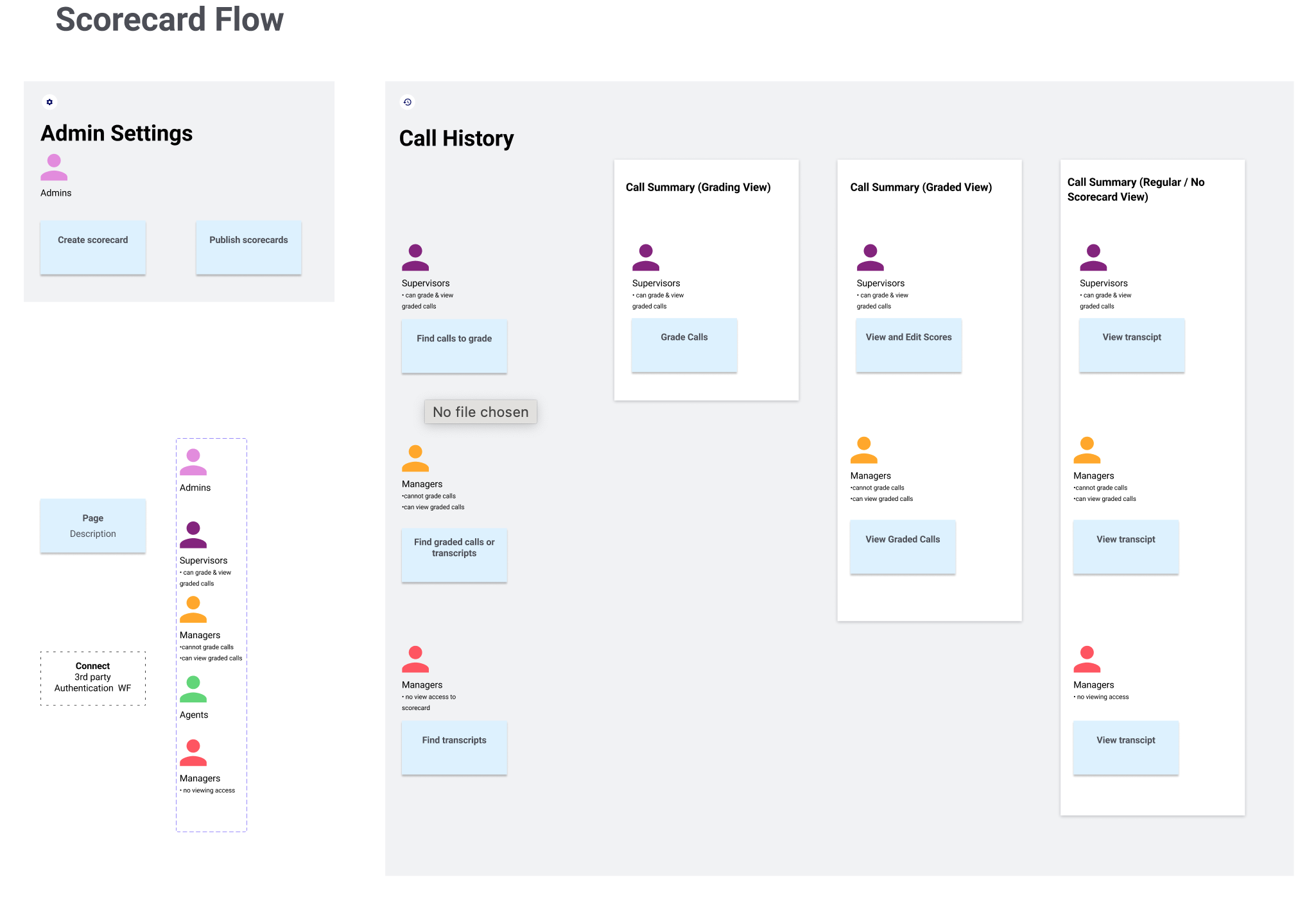
As Dialpad is a SaaS company, different subscription and licenses are offered. Employees same roles within the company might have different feature access based on the license they are on. We came up with charts to further differentiate the type of access and permission they have on individual page.
Ideation & Validation
How should scorecards be created?
Building a benefits package is overly complicated, and many of our stakeholders get confused during discussions. Classes and Eligibility Mapping are lingos very specific to benefits, and many of stakeholders get confused durin discussions. confuse I came up with an analogy to help simplify the process:
Initial Iteration
With the goal of giving the manager the space of focusing on creating the scorecard, so white space was intendeded to
Final Design
After testing, managers are
How can we create the best grading experience for the supervisors?
Many options were explored on how we can create the best grading experience for the managers. I originally went with the existing call summary pattern to figure out how can grading be incorporated into the page.
Low-fidelity explorations

Proposed Solutions


Through internal feedback, i deviated from existing pattern and explored numerous option of two column layout and was well received due to the wider real-estate and flexibility.
Final Design
However despite the well-received exploration from internal stakeholders, the process of revamping the transcript/ call summary page is simply out of engineering scope. Additionally some users are already used to the three-column layout so we decided not to switch up the user's mental load.
North Star
Automate call grading with recommended semantic- analysis suggestions
Edited on Jan 2024
The two exploratory north star feature has been rolled out. Even though I am no longer to over see the project but I am happy to know that my design was still used and implemented.
- • Use sentimental analysis (Vi) to help answer the questions: allow admins to come back to finish the work as the process may be tedious.
• Connect call summary to custom moments: allow admins to double check on their work before creating class creation, plan eligibility mapping that might impact the entire benefits package
Learning
Push boundaries but also know when to come back down
I stretched the design with 5 Broker Partners and Benefits Specialist. Overall the usability was rated very well, however we received feedbacks that roadblocks are needed to slow down the creation process. It is much easier to create a brand new ruleset and eligible mapping than to fix a mistake later on during the renewal cycle.


