Get In Touch

Hack Your Course
Lifting the Community to New Heights
Date: May 2018
Type: School Project
Role: UX Designer
Skills: UI, UX Design & Interaction
Deliverables: Responsive website design
Team: 3 UX & 2 UI designers

Finding Tutors Online
How we helped parents to find Hack Your Course tutors by designing a mobile responsive website through improving information architecture and visual elements.
The Brief
How might we help HYC to attract more students online?
Hack Your Course is a local tutoring service located in North Vancouver. With its value of supporting the local community, the agency pays the tutor more than the industry average. Many users resonate with the value and has been growing consistently. Hence HYC approached us hoping to build a stronger online presence, hoping to help more students in Vancouver.
Identifying tHe Friction
Usability Testing
We conducted user testing by asking 2 parents and 5 students (aged between 20 to 50, experienced with the use of computers).
The objective of the user testing was to understand:
- First impression: if the information would capture their attention
- Ease of use: to see if the tutor seekers are able to find the necessary information
Other than comments regarding the visual aspect, the new customers are weary about the credibility of the tutoring service. Additionally, with the misleading navigation buttons, many users have to go through different pages to find their desired information.

Competitor Analysis
Get to know the existing services Heuristic evaluation among competitors

Google Analytics
The website has high bounce rate and with only 1 session per user, it shows that many users exit the homepage immediately without bothering to check out the content. Additionally Programs, followed by Values, and Contact us are the most visited pages on the website.

Interviews
ReferALs are key
First, we arranged phone calls with 3 existing parents/customers to understand their initial impression of the website. From the interviews, we learned that parents heavily rely on friend referrals and recommendations when finding a tutor for their children. As there are many horror stories, they are mostly looking for a passionate tutor who is able to teach according to the children’s ability and skills.
Empathy Mapping
Everyone on the team all had experience getting a tutor when we were young. However, as majority of the website users are young parents. We adopted the mindset and perspective of a parent, empathizing with their needs and concerns in order to find the best tutor for their children.
Surveys
We were able to gather 159 survey responses after distributing on Facebook, Reddit and other online forums. The respondents varied in age (19 to 65+) and number of children (0 to 4+), which were a good representation of the potential customers that HYC is looking for.
Majority of the parents look for tutors when their children could not keep up with the school work. This implies that they would look for someone who has good teaching experience and qualification.

Since teaching quality could be subjective, many of the parents look for referrals. The survey validated our interview as words of mouth is the most popular mean when looking for a tutor. 93% said that a positive or negative review would affect their decisions in picking a tutoring service.

Information Architecture (Participatory Design)
To restructure the navigation for more clarity, we did a few open card sort with some users. Some of the headers are not important and could be renamed or moved inside another heading.

We invited several users in for card sorting, and asked to categorize the information. Through the insight, we narrowed down the menu navigation to six categories. From the research, parents are the most interested in looking for tutors that would suit their children’s need. Hence, they would want to look for tutors based on teaching ability rather than subject proficiency. We also added Reports, as that that is a feature that is only offered by HYC. We hid Join Our Team as the website is mainly targeted to those looking for a tutoring, rather to those looking for tutoring opportunities.

Grouping the Data
We grouped our ideas using an affinity diagram, tried to find trends and insight from our research.
Key Insights
- Majority of the website visitors use their phone - hence we decided to adopt a mobile-first design approach
- Users prefer to seek tutors through referral through immediate network, as they are skeptical about the teaching quality
- Parents like to look for tutors based on teaching ability/ passion rather than subject proficiency (For example, a qualified math tutor may not have the patience to handle elementary students.)
What made existing parents trust HYC?
Through our research, we have determined that trust and referrals are important. When we were compiling our data, we started to identify four main themes in the reasons why parents selected HYC. The user interview was later validated through reviews we found on various sites. We decided to emphasis HYC's values and practice to further re-inforce parent's trust.

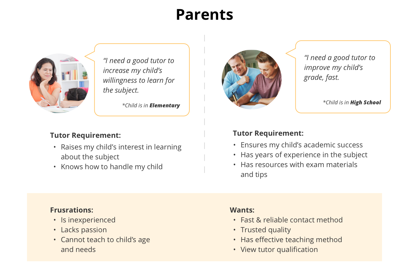
Personas
From our research, we synthesized and evaluated two most common customer scenarios: parents looking for a tutor for their kids in elementary or high school.
Ideate
Our Solutions

Concept
Prototyping & wireframes
We began by sketching on paper during our Sprint in week 2 and quickly developed a low-fidelity paper prototype to collect user feedback that was focused on interactions rather than visuals. We then tested our high-fidelity prototype on Invision to ensure that our desired personas will be able to reach their goals.

Mobile-first Approach

Menu Navigation
In the landing page design, we put extra emphasis on the mobile, and broke the page into sections.
Mobile users tend to scroll up and down to find the information, so we decided to unveil a snippet of the pages, and let the user click and search for information that they are most interested in.
Contact based on device
Users use their devices differently. During testing, we discovered that if users are using mobiles, they would prefer to call the HYC immediately rather than sending a lengthy email.

Iterations
We asked 8 users to test on our mid-fidelity prototype. With the task to "find a math tutor for your daughter in high school", we close observed their navigation pattern. We collected feedback along the make improvement for the prototype.
Call Button

Feedback
Some users complain that the circular Call button at the bottom is distracting to the overall mobile website experience.
Concern
The problem occur as many users are right-handed, hence they often accidentally press on the button when scrolling down. However, moving the button to the left side
Solution
We decided to forgo the floating circle by making the Call button to cover the entire bottom screen. The CTA is not only even more visible and cause less distraction for the users.
Search For Subjects

Feedback
Many of the older parents didn't know that they could use the swipe gesture when browsing on the website.
Concern
The original goal was to show what type of subjects are offered by HYC. Even though many of the newer phones allow swiping on the web browser, we also took into consideration from the web developers that such feature takes longer to code on their end.
Solution
We decided to move the section to include in the hero image, so that users can immediately select their desired tutor without scrolling down. (We also deleted type of tutoring, as the head tutor mentioned that majority of the users only seek one-on-one tutoring as of right now.)
UI Re-design
Since my role is UX design, the wireframes were handed off to the other UI designers on the team. After delivering the client proposal, I wanted to challenge myself as a holistic designer, so I re-created the UI that aligned to my vision.

Logo Design

"Lifiting the Community to New Heights"
I decided to use the sun and pencil to convey the business message. Since pencil is often times associated with education. The final vector design has a hidden up arrow within the pencil, signifying that HYC can lift and help the students to achieve a brighter future through their tutoring service.
Visual Guide
I decided to use royal blue and canary yellow, as the two colours convey a sense of academic and professionalism. The stickmen figures replaced the jpeg images, as they are timeless and would appeal to both parents and students browsing on the website.


Prototype
Design Highlight
Click for Invision prototype:
You could click on the Invision prototype below to gain a deeper understanding of the entire flow.


Future Considerations
We had a lot of fun researching and designing for the websit. However, we were not able to accomplish all the features within the span of three weeks. Below are some of the nice to have features that would have been helpful to both HYC and the users, which includes:
- Case Studies
- Referral Programs
Learning + TakeAways
RESPONISVE VS ADAPTIVE DESIGN:
As a responsive design project, I have to think twice in how to adjust the content appropriately between the mobile and desktop version. I have learned a lot (the hard way) and now I am always weary of the breakpoints in the wireframe design!
DESIGN THE WHOLE EXPERIENCE:
During my design process, I’ve always focused on the online experience of the users, and often neglected the offline journey of the customers. As an UX designer, I have learned and now strive to always think and improve user’s experience in every aspect!
Summary
How might we help HYC to attract more students online?
We designed a responsive website through adding visuals and re-arranged information.
We added user reviews and tutor information to increase user confidence in finding a tutor from HYC.


