Get In Touch

Zenefits - Design System

I was part of the small team that maintain and improve the Zenefits design system - Zenebits.
Our goal is to ensure that the design system could be used by design, engineering (and product) teams efficiently and at scale.
By transitioning the design system to Figma and raising company-wide awareness, we were able to aggregate existing design resources and expand its scope by 20%. In one year, I helped created 250 new UI components, controls, patterns; maintaining nearly 800 components.
Role
Started as Product Design Intern, then Associate Product Designer. I worked under the guidance of Matthew Wager (Principal Designer) and David Hirtle (Senior UI Engineer)
My Responsibility
Component building, interaction design, user research, public speaking
Timeline
January 2019 - April 2020
Problem

Lack of design guidance and standards
When I joined, the team has just switch the tooling from Sketch to Figma, and also in the middle of transitioning Front-end language from Embers to React. Hence Designs were inconsistent across all teams - designers were using the wrong style or the engineers simply are still using the old style guide.
Gap in knowledge about design system
The idea of following the design system is still a budding idea for everyone in the product org, other than the core design systems team, barely anyone knows about its existence as well as how to apply in their work.
Goals
An all-in-one HR solution for the company admins
Our team's primary goal was to launch a brand new app that would allow the admins to generate a total rewards statement.
The project success meant establishing a stronger reliance for Zenefits from the admins, which ideally would grow our active user base and engagement level.
UX Goals
- • Automatically pull data from different sources
• Accurately calculate and display all data
• Create templates for easier re-usability
Business Goals
- • Increase the number of Payroll & Benefits add-on in the subscriptions
• Collect data to strengthen the benchmarking capabilities in Compensation Management app
Solutions
Our team's primary goal was to launch a brand new app that would allow the admins to generate a total rewards statement.
The project success meant establishing a stronger reliance for Zenefits from the admins, which ideally would grow our active user base and engagement level.
Result
> 500
Project Goals
+ 100
Project Goals
+ 15
Project Goals
Our team's primary goal was to launch a brand new app that would allow the admins to generate a total rewards statement.
The project success meant establishing a stronger reliance for Zenefits from the admins, which ideally would grow our active user base and engagement level.
Audit & Build
I observed and took notes of the current design process. I chatted with members on the design, UIE and product engineering team to learn about some of the pain points they are facing in their every day workflows.
I quickly learned that this a misalignment and wrong expectations from both the designers and engineers, multiple interpretation of the current Zenebits design system emerge. With this problem constantly reappearing, the lack of awareness and proper cross-team collaboration have to be addressed.
To tackle the issue of many versions of components, we relied on Brad Frost's Atomic Design methodology and Alla Kholmatova's Design Systems.
The complexity of the problem was rooted in how deep the pain-points were intertwined with one another. Processes and culture cannot be changed in one day. Yet, with the notion of improving one component a day. we spread our influence in the following ways to help team better facilitate and understand the importance of design system.
Following the Atomic Design Method

I audited the smallest attributes to the patterns, gaining a deep understanding of the reasoning behind a component structure.
As a result, not only it has allow me to build the Figma components correctly, I was even able to identify components that were built wrongly on the web.
Build reusable components with 80% use case in mind
To ensure that the components are build correctly from the start, we followed the template and that would allow us to consider about 80% of all use cases.
Learning how to build components Figma

When we switched from Sketch to Figma, no one on the team knew the best way to build the components.
I went through thousands of tutorials (such as Designcode.io) to ensure that the components if build right from the foundation, so that the designers have no reason to detach the instance.
Creating a Shared Language

Developing a shared language is an ongoing process that requires time, which results in better understanding. Understanding how components are named in Figma allow both the designers and engineers is critical to achievement alignment.
Documentation
A successful ever-lasting design system starts with a formulated strategy. As our products evolve at a rapid pace, prioritizing a concrete foundation first can align all our digital products into a cohesive experience. To visualize this approach and why we did it, we relied on Brad Frost's Atomic Design methodology to start the process:
Creating a single source of truth

A successful ever-lasting design system starts with a formulated strategy. As our products evolve at a rapid pace, prioritizing a concrete foundation first can align all our digital products into a cohesive experience. To visualize this approach and why we did it, we relied on Brad Frost's Atomic Design methodology to start the process:
Get In Touch
Socialize
To understand the root of the problem to its core I conducted user interviews to multiple members of the design and development team. Asking questions such as: how do you refer to the design system in your day-to-day process? What are some of the barriers you encounter when using the design system? Turns out, there were multiple versions of how the ‘source of truth’ was and how it was interpreted.
Moving Forward Only with React

In order to achieve alignment on the UI, the usage of Ember has to be discouraged. By standing our ground of refusing to fix any non-React UI changes, we put pressure on the product and engineering team to dedicate more time on their roadmap to make the front-end code transition.
Also memes were created and posted to slack channels for some jokes and laughter ;)
Design System 101 Workshop

This presentation is a proper educational hand-off to everyone - the design, engineering and product management. This includes the foundational importance of the design system, the technical processes involved, a demo in Figma and in React.
Slack Updates

We have a dedicated Slack channel to design system. Whenever there is an update on Figma or ui.zenefits, I made sure to call out all the updates and be transparent about all the changes.
Developers' Guide to Figma
Since new engineers are continuously joining, I created a simple a simple guide on educating on how to use Figma in order to find the correct components. By doing so, we hope to reduce friction during the handoff process, such that the designers do not have to worry about addressing the simple UI concerns and instead focus on the deeper UX issues.
Maintain
To understand the root of the problem to its core I conducted user interviews to multiple members of the design and development team. Asking questions such as: how do you refer to the design system in your day-to-day process? What are some of the barriers you encounter when using the design system? Turns out, there were multiple versions of how the ‘source of truth’ was and how it was interpreted.
Figma Library Analytics
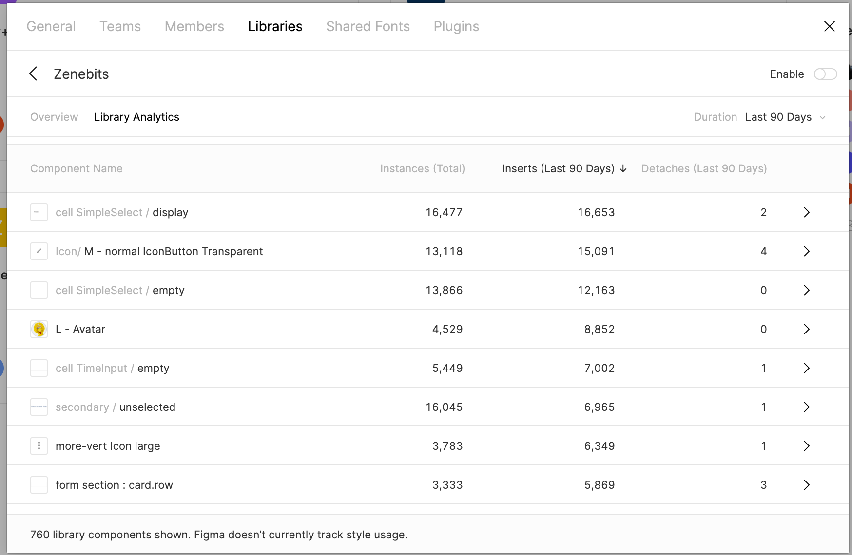
Leveraging the built-in analytics feature that Figma introduced in later 2019, I was able to identify which components are being detached from the library and why. It also gave me an opportunity to investigate components that are not being adopted by the designers, and archive them if necessary.
Improving existing components

As our product is constantly evolving, the design system should evolve as well.
For example, having placeholders
Introducing New Patterns

We introduced new patterns of how the admins can categorize workers in a Rule Editor or People Picker. Multiple products have adopted this method.
Learning
To understand the root of the problem to its core I conducted user interviews to multiple members of the design and development team. Asking questions such as: how do you refer to the design system in your day-to-day process? What are some of the barriers you encounter when using the design system? Turns out, there were multiple versions of how the ‘source of truth’ was and how it was interpreted.


